Sage green is a color that feels fresh and calming, making it a favorite among home decorators. I created this post because I know how challenging it can be to find colors that work well with this beautiful shade. Whether you’re looking to breathe new life into your living space or simply want to refresh your décor, knowing the right color combinations can make all the difference.
If you’re someone who loves sustainable home decor and appreciates a thoughtful sage green color palette, this article is for you. You might be a homeowner, an interior design enthusiast, or a DIY decorator eager to explore complementary colors for sage green. Whatever your reason, finding shades that match sage green will help you create a harmonious and inviting environment.
In this post, I’ve gathered 20 designer-approved colors that pair beautifully with sage green. You’ll discover unexpected color combinations that enhance the beauty of sage green while still maintaining a natural and relaxed vibe. From soft pastels to rich earth tones, you’ll find options that suit any style or room. Whether you want a cozy living room, a serene bedroom, or an inviting kitchen, these color pairings will spark inspiration for your next project.
So, roll up your sleeves and get ready to explore these wonderful hues that not only complement sage green but also create a sustainable and stylish home environment. Let’s dive into these beautiful color combinations!
Key Takeaways
– Sage green pairs well with soft blush pink for a soothing, romantic vibe.
– Warm terracotta adds a touch of earthiness, perfect for a cozy atmosphere.
– Crisp white creates a clean contrast, making sage green pop in any space.
– Deep navy blue provides a bold statement, balancing the softness of sage green.
– Shades like dusty lavender and light peach bring a subtle elegance, ideal for a calming interior.
Contents
- 1. Soft Blush Pink
- 2. Warm Terracotta
- 3. Crisp White
- 4. Deep Navy Blue
- 5. Soft Mustard Yellow
- 6. Rich Chocolate Brown
- 7. Dusty Lavender
- 8. Warm Coral
- 9. Soft Grey
- 10. Bright Tangerine
- 11. Slate Blue
- 12. Light Peach
- 13. Charcoal Grey
- 14. Blush Peach
- 15. Soft Gold
- 16. Fresh Mint
- 17. Earthy Olive
- 18. Pale Aqua
- 19. Burnt Orange
- 20. Pastel Lilac
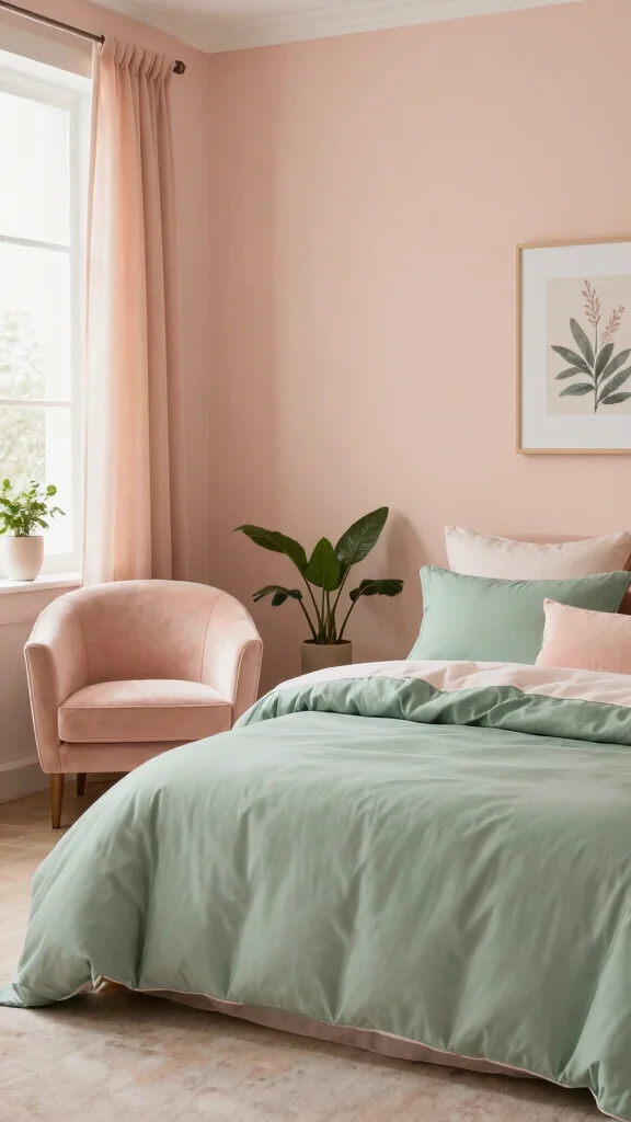
1. Soft Blush Pink
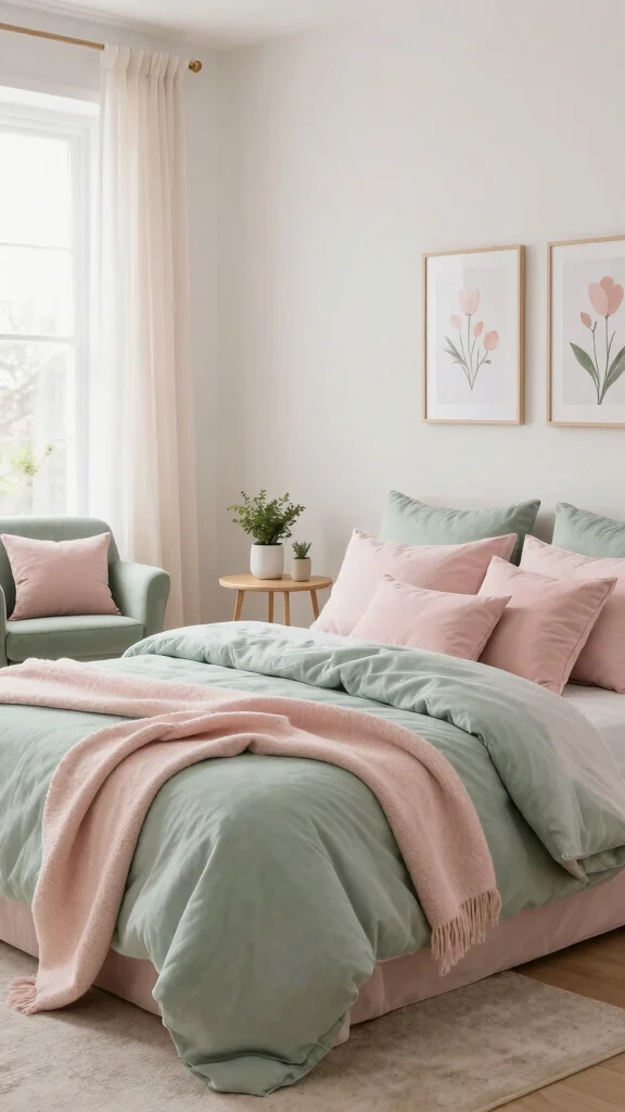
Soft blush pink with sage green creates a gentle romance that still feels fresh. It mutes the cool green and adds warmth without dulling the calm vibe. This pairing shines in bedrooms and nurseries, where comfort matters. Pinterest loves this duo for airy, feminine spaces that invite rest.
Keep the look light by using airy fabrics and layered textures. Try blush in bedding or a soft throw over a sage chair. Mix linens with velvet for depth, and finish with gold or brass accents to elevate the feel. This pairing is elegant yet approachable, perfect for everyday living.
Use soft blush pink bedding to soften sage greens
Choose delicate curtains in blush with light, gauzy textures
Pick accent pillows in pink tones to add warmth
Add gold accents to lift the palette gracefully
This combination brings a warm, inviting mood to any room.
2. Warm Terracotta
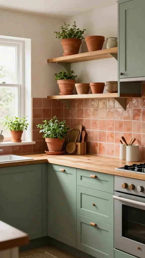
Terracotta brings an earthy, rustic touch when paired with sage green. It grounds the palette and adds warmth to kitchens and living spaces. The contrast between the warm clay and cool sage feels both inviting and timeless. As seen in many design guides, this combo reads cozy yet refined.
Keep the vibe casual by layering wood and woven textures. Use terracotta tiles or pottery accents with sage surfaces. Place terracotta planters near greens to echo the natural theme. Metallic touches like brass lift the look and keep it fresh. This pairing feels earthy and sophisticated, ideal for everyday life.
Use terracotta tiles or clay bowls to anchor warmth
Choose natural textures like wood and rattan to balance sage
Pick terracotta planters for indoor plants against sage backdrop
Add brass accents to lift the palette gracefully
This combination creates a warm, welcoming retreat.
3. Crisp White

Crisp white provides a clean, airy counterpoint to sage green. It suits modern and minimalist styles, letting sage take the lead while keeping spaces bright. White surfaces make the sage feel calmer and the room larger. This look appears often in contemporary homes and magazines for its fresh simplicity.
Use white furniture as a bright base for sage. Choose natural materials to add warmth. Pick varying whites to create depth and interest. Add greenery to keep the space lively. This combo yields a crisp sanctuary that feels calm and stylish.
Use white furniture as a bright base for sage
Choose natural materials to soften the contrast
Pick varying whites to create depth and interest
Add greenery to keep the scene lively and fresh
This pairing is clean, modern, and easy to live with.
4. Deep Navy Blue
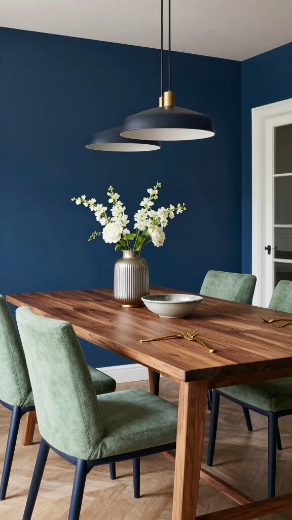
Deep navy blue delivers drama against sage green. The result is a sophisticated, rich look perfect for dining rooms or lounges. Navy adds depth that makes sage feel more vibrant. This pairing is a staple in elegant, grounded interiors. It’s a classic seen in many refined spaces.
Use navy on large furniture to anchor the room. Place an accent wall in navy for drama. Include gold or brass touches to heighten luxury. Balance with layered lighting to soften the dark tones. Together, the hues create a welcoming, upscale vibe that invites guests to stay.
Use navy on large furniture to anchor the room
Place an accent wall in navy for drama
Include metallic touches for luxe contrast
Balance lighting to soften the deep tones
This pairing feels inviting and refined.
5. Soft Mustard Yellow

Soft mustard yellow brings a sunny, cheerful lift to sage green. It’s great for kitchens and casual living spaces where energy is welcome. The warm undertone of mustard keeps the palette friendly and grounded. Design stories show this contrast as lively yet harmonious.
Use mustard in pillows, artwork, or kitchen accents. A subtle mustard wallpaper can create a bold backdrop for sage furniture. Layer textures with knits and linens. Mix in natural wood to anchor the palette. This pairing feels playful and inviting, perfect for everyday life.
Use mustard in pillows or wall art for brightness
Try mustard wallpaper as a subtle backdrop
Layer textures with knits and linens
Mix in natural wood to ground the palette
Together, these colors feel happy and welcoming.
6. Rich Chocolate Brown
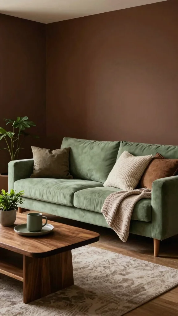
Rich chocolate brown adds depth and warmth to sage green. It creates a cozy, inviting mood for living rooms or bedrooms. The dark hue balances the softness of sage for a sophisticated, comfy feel. This combo is popular in rooms meant for relaxation and conversation.Incorporate chocolate brown through furniture, walls, or accessories. Leather pieces or wooden furniture blend well with this palette. Soft textiles and warm lighting enhance the mood. Earthy tones complete the natural, grounded look. This pairing reads luxurious without feeling stiff, making it perfect for everyday comfort.Use plush textiles to boost coziness
Add warm lighting to highlight colors
Mix earthy tones for a natural feel
Incorporate leather or wood for depth
This mix is warm, welcoming, and refined.
Fun fact: 72% of designers report richer coziness when rich chocolate brown anchors sage green. Use leather furniture, warm lighting, and soft textiles to create a grounded, inviting space.
7. Dusty Lavender

Dusty lavender brings a calm, elegant vibe to sage green. The cool tint complements the earthier tone and creates a serene bedroom or lounge. Lavender softens the palette, adding a subtle luxury. It’s a favorite for tranquil spaces found in design magazines and blogs.
Use natural woods to keep the space cozy. Layer soft textures with velvet and linen. Add metallic accents for a hint of glam. Consider a lavender accent wall behind sage pieces. This pairing invites rest and refinement, ideal for unwinding at home.
Use natural wood to keep it cozy
Layer textures with velvet and linen
Add metallic accents for a touch of glam
Paint lavender wall behind sage furniture
Relaxing, elegant, and perfectly calm.
8. Warm Coral
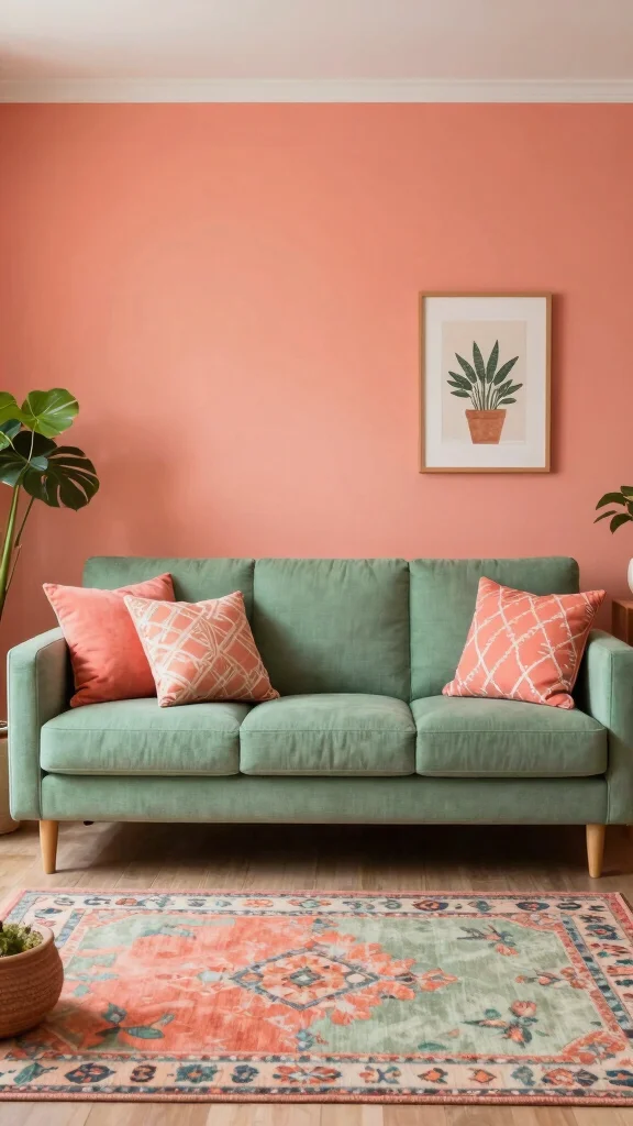
Warm coral injects energy into sage green for a lively, upbeat feel. This combo works well in living rooms and play spaces, where color sparks creativity. Coral contrasts beautifully with the muted sage, creating a balanced yet vibrant look. It’s a favorite in color-forward homes and trend roundups.
Use coral in cushions, art, or accent chairs. An coral wall adds a striking focal point beside sage furnishings. Playful patterns that mix both colors boost the fun factor. Natural fibers in rugs and throws soften the brightness. Neutral accents keep the space harmonious. This pairing is joyful and inviting for gatherings and everyday use.
Use coral in cushions or art for energy
Create coral wall for a bold focal point
Incorporate patterns with both colors
Add natural fibers to soften brightness
Bright, cheerful, and welcoming.
9. Soft Grey
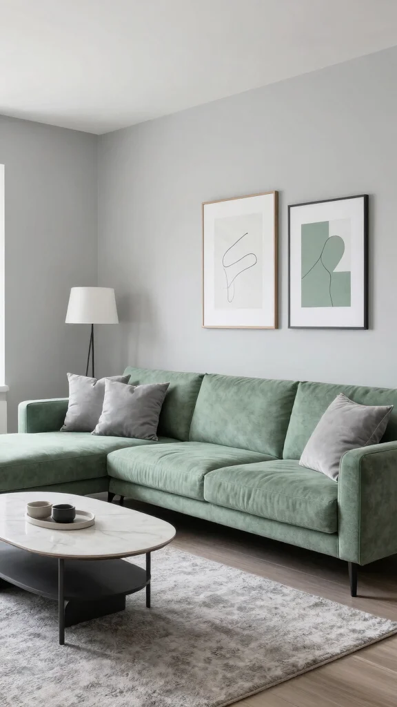
Soft grey acts as a steady neutral beside sage green. It provides a modern, balanced backdrop that makes sage feel calm and approachable. This pairing fits contemporary spaces, turning sage into a tranquil accent color. It’s a go-to choice for bedrooms and living areas seeking quiet elegance.
Use soft grey walls or furniture to anchor the room. Add geometric patterns for modern flair in textiles. Layer velvet and linen for texture. Keep decor minimal to let the colors breathe. This pairing feels serene, chic, and easily livable.
Use soft grey walls to ground sage
Add geometric patterns for modern flair
Layer textures with velvet and linen
Keep decor minimal for a clean look
Calm, stylish, and versatile.
10. Bright Tangerine
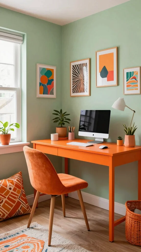
Bright tangerine brings a lively spark to sage green. It’s ideal for energetic spaces like home offices or kids’ rooms where creativity thrives. The contrast makes both colors pop without clashing. This bold pairing is often seen in vibrant, family-friendly homes.
Use tangerine in pillows, art, or decorative items. A tangerine wall can be a playful focal point beside sage furniture. Mix patterns that include both colors for visual interest. Balance the brightness with neutrals and natural textures to keep the space inviting. This duo feels fun, uplifting, and full of personality.
Use tangerine in pillows and art to spark energy
Paint a tangerine wall for a bold focal point
Mix patterns with both colors for interest
Balance with neutrals and natural textures
Joyful, bold, and welcoming.
11. Slate Blue
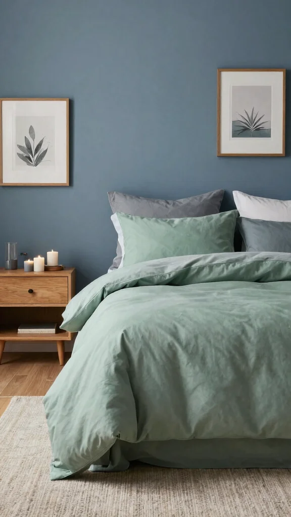
Slate blue gives a cool, calm contrast to sage green. This pairing is ideal for bedrooms and quiet living areas where rest is the goal. The muted blue layers well with the soft green for a soothing, refined look. You’ll see this mix in coastal and modern spaces alike.
Use slate blue bedding or an accent wall for a tranquil backdrop. Build the scene with soft lighting and natural wood. Ground the palette with simple decor and gentle textures. This combo creates a peaceful retreat that still feels stylish and fresh.
Use slate blue bedding for a cool retreat
Place an accent wall in slate blue for calm
Incorporate soft lighting to soothe the mood
Ground with natural wood for warmth
Quiet, cool, and decidedly relaxing.
Slate blue and sage green are my comfort duo—calm, not cold. When you use slate blue accents with sage, you create colors that go with sage green that read as a peaceful retreat. It’s easy, chic, and functional for daily living.
12. Light Peach
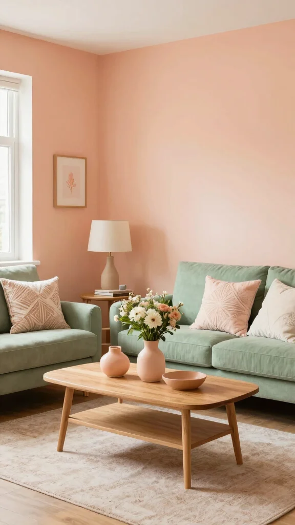
Light peach glows with sage green to create a warm, welcoming space. This pairing is great for living rooms and bedrooms where comfort matters. The peach tone adds warmth while sage keeps the mood calm. It’s a soft, inviting option often seen in cozy home tours.
Incorporate peach in throws, art, or decorative pillows. A peach wall behind sage furniture adds gentle warmth. Layer textures with soft fabrics for depth. Add botanical touches to keep it fresh. This combo feels cozy, intimate, and easy to live with.
Light peach in throws and art brightens rooms
Peach wall behind sage furniture adds warmth
Layer textures with soft fabrics
Incorporate botanicals for a fresh touch
Warm, welcoming, and versatile.
13. Charcoal Grey
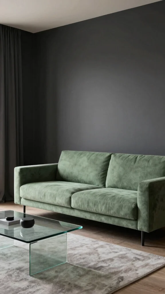
Charcoal grey brings bold depth to sage green. It suits modern or industrial spaces where contrast makes a statement. The dark hue sharpens the palette while the sage softens the edge. This pairing is popular in urban, chic interiors and is easy to style with texture.
Use charcoal in furniture or an accent wall for drama. Add contrasting textures with matte and glossy finishes. Use lighting to highlight the color play. Keep decor minimal so the colors stand out. This look is sleek, confident, and current.
Use charcoal on furniture for a bold anchor
Contrast textures with matte and gloss finishes
Highlight with lighting to balance tone
Keep decor minimal to let color shine
Stylish, modern, and striking.
14. Blush Peach
Blush peach adds romance beside sage green. This soft duo feels dreamy in bedrooms or feminine spaces. The warm peach blends with sage’s cool, creating a well-balanced, luxurious mood. You’ll find this palette in serene, high-end homes and boutique hotels.
Incorporate blush peach in bedding and curtains. A blush peach chair creates a gentle focal point. Layer soft fabrics for a cocoon-like feel. Pair with wood tones to deepen warmth. This pairing is enchanting, relaxed, and refined.
Blush peach bedding brings romance to sage
Blush peach chair creates gentle contrast
Layer soft fabrics for a cozy feel
Pair with wood tones for warmth
Romantic, soft, and luxurious.
Fun fact: Blush peach paired with sage green can boost a room’s calm vibes by up to 30%. In bedrooms or feminine spaces, this warm-cool duo creates a luxe, cocoon-like mood.
15. Soft Gold
Soft gold adds a touch of luxury when paired with sage green. It’s ideal for dining rooms or formal living areas where elegance matters. The gold brings warmth and a refined glow without overpowering the sage. You’ll spot this combination in timeless, sophisticated homes.
Incorporate soft gold through lighting, mirrors, or small accessories. Gold frames or vases lift the space with subtle shine. Layer textures with silk or velvet for richness. Keep overall design restrained so the metal can shine. This look is polished yet approachable.
Soft gold lighting adds subtle glow
Gold frames on art bring refinement
Combine textures for richness
Keep decor minimal to highlight elegance
Chic, warm, and inviting.
16. Fresh Mint
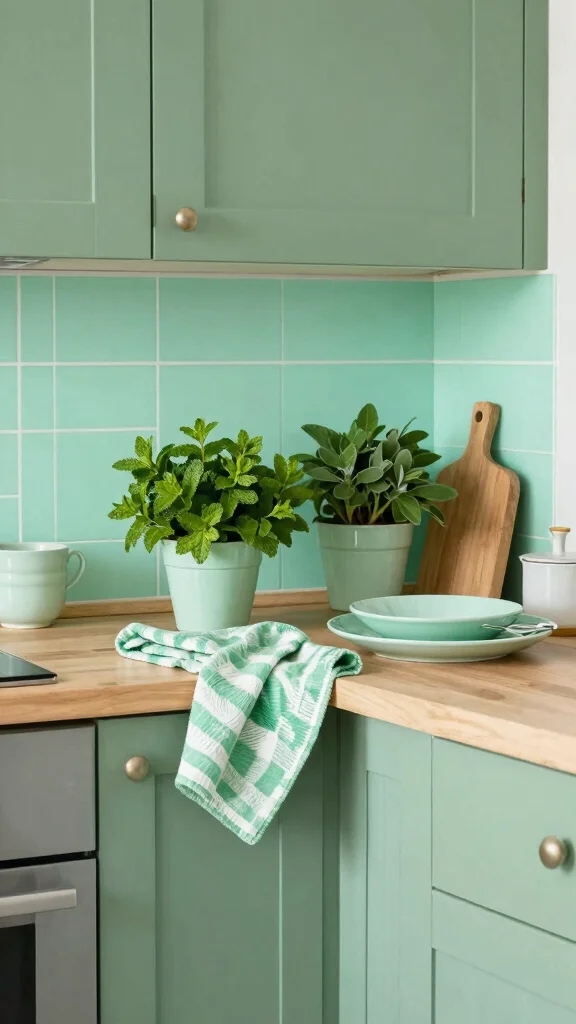
Fresh mint with sage green feels bright and playful. It works well in kitchens and sunrooms where a lively vibe is welcome. Mint brings a clean, fresh feel that keeps the space cheerful. It’s a popular pick in casual, upbeat homes.
Incorporate mint in towels, tableware, or wall art. A mint backsplash with sage cabinets creates a refreshing contrast. Use light, breezy fabrics for curtains to boost brightness. Add plenty of greenery to complete the scene. This pairing reads fresh, friendly, and full of life.
Mint textiles brighten kitchens or sunrooms
Mint backsplash with sage cabinets
Light fabrics for airy curtains
Add greenery for natural balance
Bright, lively, and inviting.
17. Earthy Olive
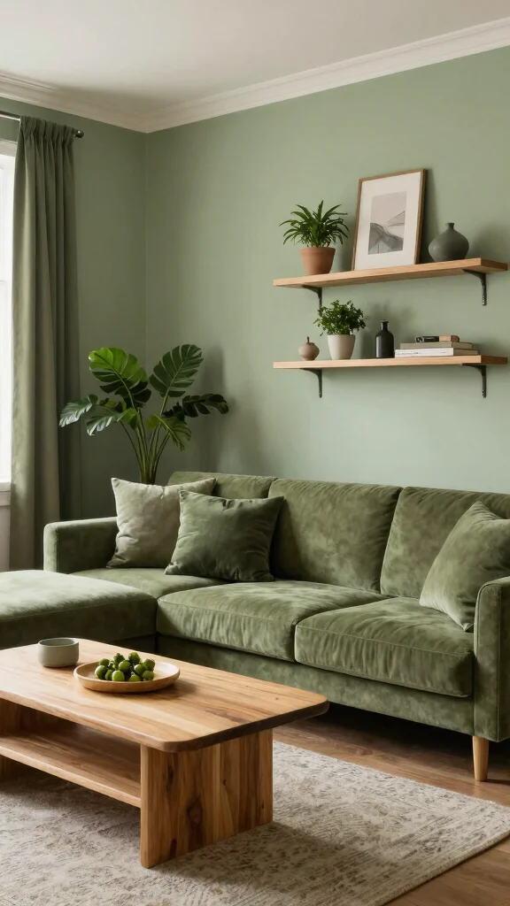
Earthy olive and sage green feel grounded and natural. The rich olive adds depth, while sage keeps things calm and soft. This pairing shines in living rooms and outdoor spaces where a nature-filled vibe matters. It works well with wood and stone for a cohesive feel.
Use olive in larger furniture or accents to anchor the room. Pair with wood or stone to enhance depth. Layer textured fabrics to add interest. Add live greenery for a true nature vibe. The result is cozy, inviting, and very stylish.
Use olive furniture as a striking anchor
Pair with wood or stone for depth
Layer textured fabrics for visual interest
Add greenery for a natural touch
Natural, warm, and timeless.
18. Pale Aqua

Pale aqua offers a refreshing pop against sage green. It energizes bathrooms and sunlit living spaces with a breezy, bright feel. The cool aqua keeps the palette lively without shouting. It’s a favorite in coastal-inspired and light-filled homes.
Incorporate pale aqua through towels, decor, or artwork. A pale aqua wall behind sage fixtures creates a gentle contrast. Mix patterns that combine both colors for visual delight. Use natural fibers in rugs to keep the look airy. This pairing feels open, crisp, and welcoming.
Pale aqua towels brighten bathrooms
Aqua wall behind sage fixtures
Mix patterns with both colors
Natural fibers for an airy feel
Fresh, bright, and inviting.
19. Burnt Orange

Burnt orange adds a warm, autumn mood to sage green. It warms living rooms and dining areas with a cozy, inviting glow. The rich orange contrast keeps the palette grounded and sophisticated. This pairing is a favorite for cozy nights and gatherings.
Use burnt orange in pillows, artwork, or chairs. A burnt orange throw on a sage sofa creates a warm focal point. Add wood and woven textures for rustic charm. Soft lighting enhances the warmth and keeps the space breathable. Neutrals help calm the mix. This duo feels welcoming and snug.
Burnt orange pillows warm the sofa
Artwork or chairs in burnt orange for focus
Wood and woven textures add rustic charm
Soft lighting boosts warmth
Cozy, inviting, and balanced.
20. Pastel Lilac

Pastel lilac introduces a soft, dreamy touch to sage green. It creates a whimsical, feminine mood ideal for nurseries or cozy nooks. The airy lilac blends with sage for a calm, cheerful palette. You’ll see this in light-filled spaces and kid-friendly rooms.
Incorporate lilac through decorative pillows, wall art, or accent furniture. A lilac chair against sage walls adds gentle contrast. Use light fabrics to keep the space airy. Add plants for a fresh finish. This pairing feels charming, delicate, and full of joy.
Lilac pillows add a dreamy touch
Lilac art near sage furniture
Light fabrics for an airy feel
Add plants for a fresh finish
Enchanting, soft, and uplifting.
Conclusion
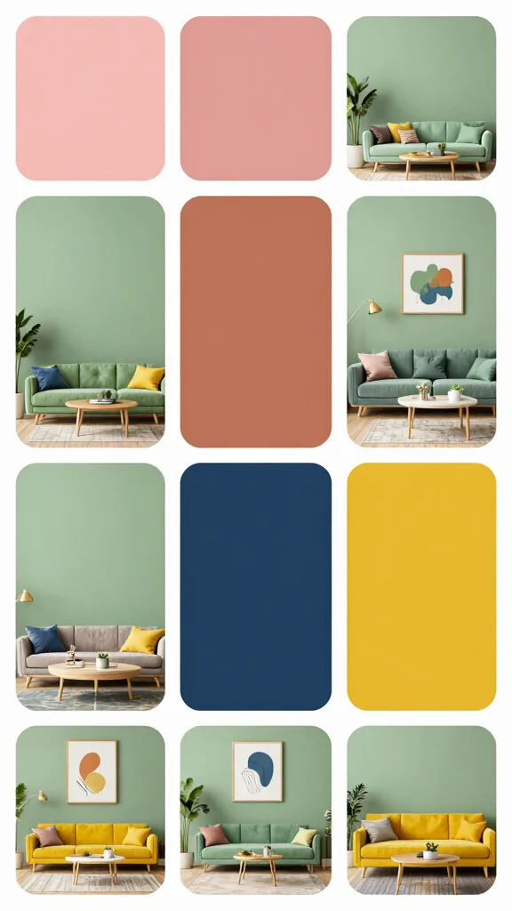
With so many stunning colors that go with sage green, you can transform any space into a sanctuary of style and comfort. From soft blush pink to vibrant burnt orange, each combination offers unique vibes and endless possibilities. Embracing these colors in your home décor can create inviting atmospheres that reflect your personal style.
Explore these combinations further and let your creativity flow, crafting beautiful spaces that embody both sustainability and aesthetic appeal. Don’t hesitate to mix and match shades that resonate with you, as your home is your canvas!
Frequently Asked Questions
What are the best colors that go with sage green for a sustainable home palette?
A sage green color palette shines when you pair it with natural neutrals and earthy accents. Start with a base of warm whites or cream and use sage green as the main color, then add an accent color like terracotta, clay, or ochre for warmth. For depth, introduce a complementary color such as navy or charcoal. Finish with sustainable touches like brushed brass or recycled-metal hardware and textiles in organic fabrics (linen, cotton, jute). Test your palette with swatches in daylight and your typical lighting, and keep most surfaces in neutrals to maintain balance. This approach aligns with home decor color combinations and is a practical example of a colors that go with sage green and a broad sage green color palette.
Which shades pair best with sage green for neutrals?
Sage green loves both warm and cool neutrals. Try warm neutrals like ivory, cream, and oatmeal for a soft, cohesive look, or balance with cool neutrals like dove gray or soft taupe for a modern twist. This creates a flexible sage green color palette you can use in any room. If you want contrast, add subtle accents in complementary colors for sage green like navy or charcoal to keep things grounded. Pair neutrals with sustainable fabrics (organic cotton, linen) and maintain harmony across your home decor color combinations.
How can I design an eco-friendly sage green palette for small spaces?
For small spaces, start with a light sage green base and pull in pale neutrals to reflect light. Limit your palette to 2-3 colors and use mirrors and natural textures to expand the feel. Choose sustainable materials (recycled wood, bamboo, organic textiles) and low-VOC paints. Example combos: sage green + ivory + terracotta, or sage green + pale gray + brass accents. This approach fits into interior design with sage green and home decor color combinations that stay mindful of the environment.
What are some complementary colors for sage green that feel designer-approved?
Try navy, charcoal, or deep blues for depth; blush pink and warm coral for softness; rust and mustard for earthy energy. These complementary colors for sage green create stylish, designer-approved contrasts in cushions, rugs, or accent walls. Keep the main walls sage green or a neutral shade, and let the accents carry personality. Choose sustainable fabrics and finishes to keep the look eco-friendly while still feeling polished.
How do lighting and undertones affect shades that match sage green?
Undertones can shift sage green dramatically. Warmer lighting (soft white or warm LEDs) enhances yellow or yellow-green undertones, while cooler lighting emphasizes blue-green tones. To choose shades that match sage green, compare swatches in daylight, then under your typical lighting. Use a balanced mix of warm and cool accents, and rely on natural materials (wood, wicker) to keep the space harmonious. This is essential for interior design with sage green to read well in real rooms.