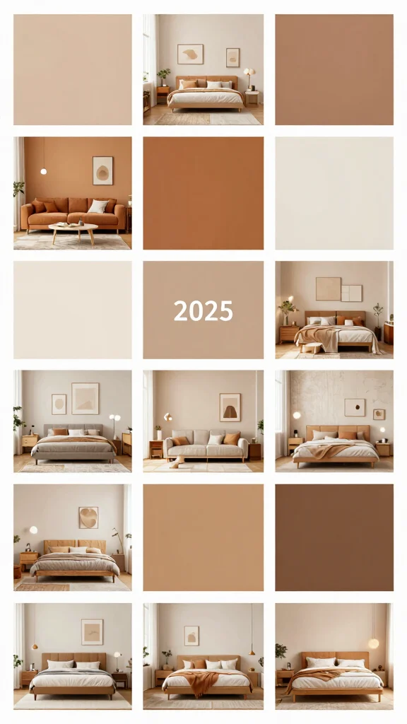
As we look ahead to 2025, many of us are ready for a change in our home spaces. Maybe you’ve been scrolling through Pinterest, dreaming of a fresh coat of paint, or perhaps you’re just tired of the same old colors that have filled your rooms for too long. Whatever the reason, finding the right color theme ideas can be the key to revitalizing your home. This post is here to guide you through the latest color trends that will take your interiors from stale to stunning.
If you’re a homeowner, renter, or anyone who has a passion for room makeovers, you’re in the right place. You care about creating a space that reflects your personality while also being comfortable and inviting. You want a home that feels good to live in and looks fantastic, too. That’s why this guide is tailored for you, packed with inspiring color palettes that are perfect for every room in your home.
In this post, you’ll discover 18 trending color palettes that are not only stylish but also practical for your everyday life. From serene sands and ocean blues to bold terracotta and earthy greens, these color themes will help you create a harmonious environment. Each palette is designed to evoke feelings of comfort and warmth, making your home a sanctuary. Get ready to dive into color combinations that spark joy and inspire transformation in your living spaces. Let’s explore the beautiful hues that can breathe new life into your home!
Key Takeaways
– Discover 18 fresh color palettes trending for 2025, perfect for any room in your home.
– Explore combinations like serene sand with ocean blue to create a calming vibe.
– Bold terracotta and earthy greens are ideal for adding warmth and character.
– Soft pastels and cool grays promote a peaceful atmosphere, great for bedrooms.
– Experiment with vibrant jewel tones for a cheerful touch that energizes living spaces.
Contents
- 1. Serene Sand and Ocean Blue
- 2. Bold Terracotta and Earthy Greens
- 3. Cool Grays and Soft Pastels
- 4. Vibrant Jewel Tones
- 5. Soft Mauve and Creamy Whites
- 6. Rustic Browns and Deep Olives
- 7. Cheerful Yellow and Crisp Whites
- 8. Soft Blush and Grey Accents
- 9. Rustic White and Charcoal
- 10. Soft Coral and Fresh Mint
- 11. Neon Accents with Neutral Base
- 12. Earthy Browns and Soft Blues
- 13. Warm Reds and Soft Creams
- 14. Classic Black and White with a Twist
- 15. Light Teal and Creamy Beige
- 16. Fresh Greens and Soft Whites
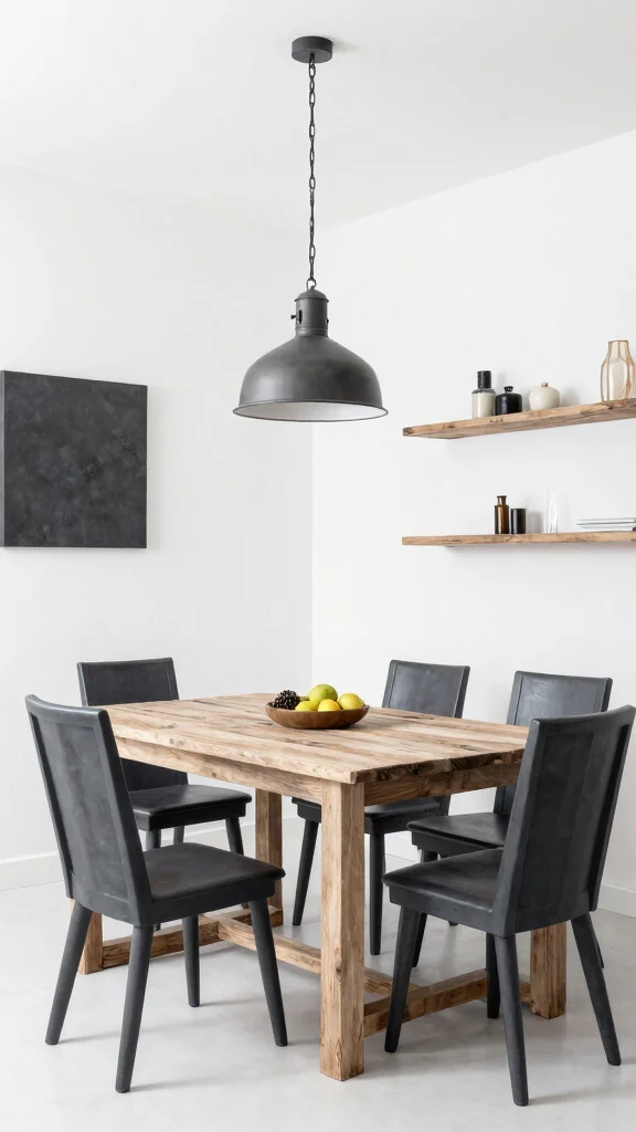
- 17. Urban Grey and Rustic Wood
- 18. Warm Peach and Deep Navy
1. Serene Sand and Ocean Blue
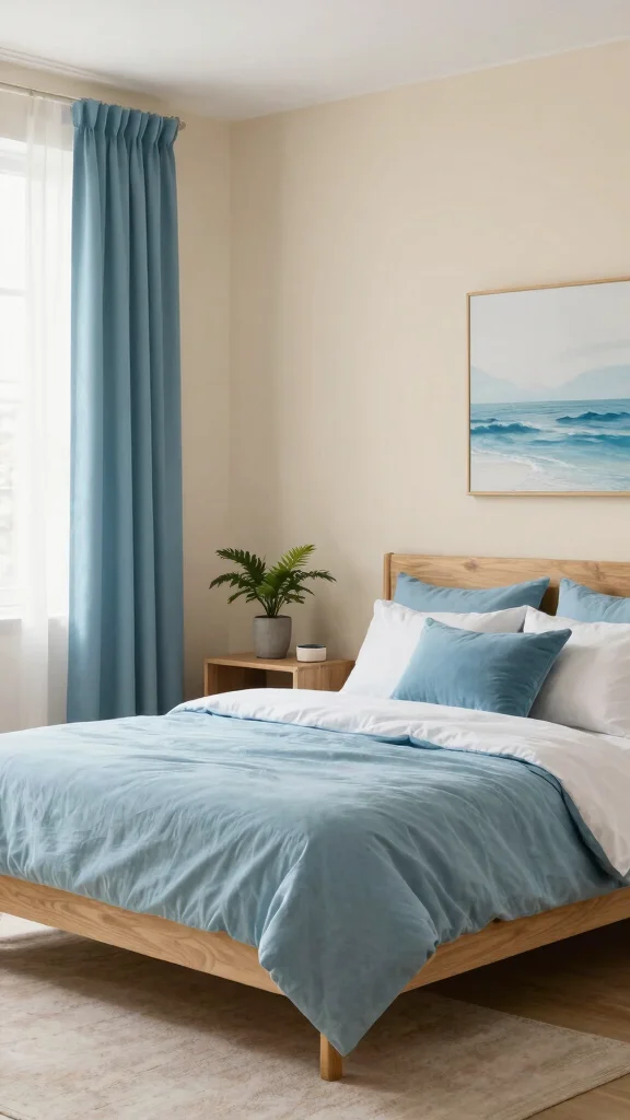
Serene Sand and Ocean Blue sets a calm mood in any room. This pairing blends soft sand walls with gentle blue accents for an airy, resort-like feel. Pinterest highlights this combo in bedrooms and baths, showing how it soothes busy minds. The result is a tranquil retreat you can call home.
Start with a pale sand wall and layer ocean blue textiles, art, and small furniture for color without shouting. Use light wood and natural textures to keep the look fresh. This approach is budget-friendly and easy to adapt as your style grows. It invites you to unwind the moment you step inside.
• Use sand walls as a calming base
• Choose ocean blue textiles for soft pops
• Add wicker textures to echo beach vibes
• Place greenery for life and contrast
It becomes a serene retreat you can return to daily.
Serene Sand and Ocean Blue proves calm spaces sell themselves. Start with pale sand walls and layer ocean blue textiles and art. A few budget-friendly color theme ideas can turn bedrooms and baths into tranquil retreats.
2. Bold Terracotta and Earthy Greens
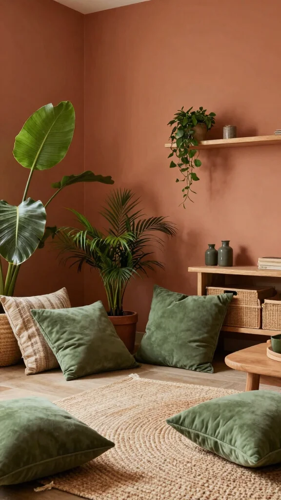
For warm charm, try Bold Terracotta and Earthy Greens. Terracotta walls feel inviting, while greens add fresh life to every corner. This look mirrors rustic landscapes and pops up in sunlit rooms on design blogs. It blends energy with nature for a grounded space.
Begin with terracotta as a feature wall or accent, then pepper in greens through plants and textiles. Mix woven fabrics and jute for texture. Pair with natural wood furniture to deepen warmth. It works well in living rooms and kitchens, and it stays cozy without feeling heavy.
• Use terracotta as a feature wall
• Choose olive greens in textiles
• Place wood elements for warmth
• Add plants to complete earthy mood
This combo makes spaces feel cozy, grounded, and inviting.
3. Cool Grays and Soft Pastels
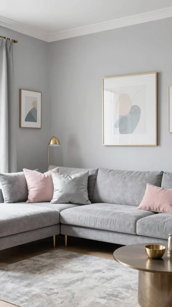
Cool Grays and Soft Pastels create a chic modern canvas. Gray acts as a quiet backdrop, while pastel accents lift mood. Urban homes embrace this pairing for offices and lounges. The look reads refined yet welcoming.
Apply a cool gray on walls or furniture, then sprinkle pastels in artwork and cushions. Add metallic hints in silver or brushed gold for shine. Keep whites nearby to maintain brightness. It stays versatile, easy to live with.
• Use cool grays as anchors
• Add pastel accents through art and textiles
• Pair with silver or brushed gold metals
• Layer whites to keep brightness
This look stays polished and inviting for daily life.
4. Vibrant Jewel Tones
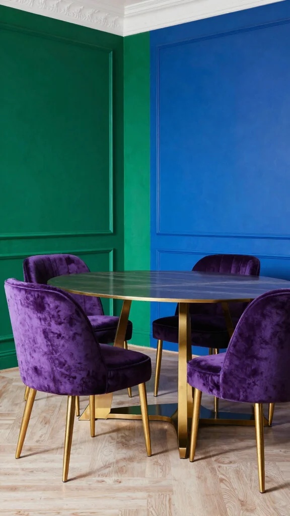
Vibrant Jewel Tones bring drama and luxury. Deep greens, blues, and purples glow in living or dining spaces. This trend shows up in designer boards and high-end rooms. A jewel wall with lighter furniture feels bold and inviting.
Choose a dominant jewel on one wall, then balance with pale furniture. Add velvet textures to deepen richness and comfort. Include brass or gold accents for a regal glow. Mix tones for a lively, layered effect.
• Use a dominant jewel on a focal wall
• Choose velvet for upholstery to deepen luxe
• Place brass accents for glow
• Layer multiple jewel hues for depth
This palette makes rooms feel lavish and boldly stylish.
5. Soft Mauve and Creamy Whites
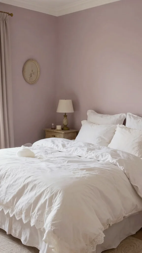
Soft Mauve and Creamy Whites offer romance with calm. Mauve can color an accent wall or bedding, while creamy whites brighten the space. Design sites feature this pairing as timeless and gentle. The feel is elegant without being fussy.
Add lace textures or vintage decor for depth. Use warm lighting to create a cozy glow. Balance soft pink with white to keep airiness. This look works beautifully in bedrooms and intimate spaces.
• Use mauve fabrics for texture
• Add creamy whites for brightness
• Place antique pieces for vintage charm
• Layer warm lighting to glow
It creates a dreamy retreat that feels elegant and calm.
6. Rustic Browns and Deep Olives
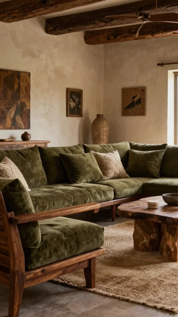
Rustic Browns and Deep Olives bring a nature vibe indoors. Rich brown woods anchor rooms, while olive greens feel fresh and earthy. This palette suits country and cabin-inspired homes. It invites comfort and a sense of welcome.
Choose wood elements as focal pieces, and add olive accents in textiles. Include stone textures to boost depth. Use big indoor plants to keep air lively. Warm lighting helps the space feel snug.
• Use wood tones as anchor pieces
• Choose deep olive accents in textiles
• Place stone textures for depth
• Add big plants for life
It makes rooms feel grounded, cozy, and welcoming.
7. Cheerful Yellow and Crisp Whites
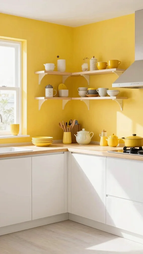
Cheerful Yellow and Crisp Whites brighten any kitchen or dining area. Yellow brings energy, while white keeps it fresh. This pairing pops in food photos and home tours alike. It feels friendly and uplifting.
Paint walls sunny or add yellow dishes as accents. Keep furniture white to maximize light. Open shelving showcases color with ease. The look is affordable and easy to refresh.
• Use sunny yellows for kitchen walls
• Choose white surfaces to reflect light
• Place colorful dishware on open shelves
• Pair with light wood for warmth
This palette invites lively meals and bright conversations.
8. Soft Blush and Grey Accents
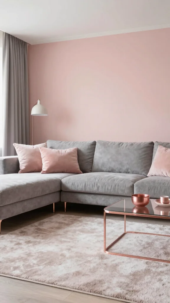
Soft Blush and Grey Accents create a gentle, romantic vibe. Blush softens rooms, while grey grounds the scene. It shows up in bedrooms and living spaces with quiet confidence. The result is polished yet comfy.
Add rose gold touches for a touch of glam. Layer plush textiles to boost warmth. Pick art that weaves both colors for cohesion. This palette feels modern, serene, and welcoming.
• Use blush textiles to soften spaces
• Choose grey furniture for grounding
• Add rose gold accents for warmth
• Layer textures with plush rugs and pillows
This look feels chic and inviting.
9. Rustic White and Charcoal
Rustic White and Charcoal make a bold yet cozy pair. White serves as a fresh canvas, while charcoal adds depth. It works in modern farms or industrial homes. The contrast stays crisp without feeling cold.
Pair with reclaimed wood to boost the rustic vibe. Install industrial lighting for a contemporary edge. Add greenery to soften the crisp lines. The look stays warm and inviting in dining or living areas.
• Use white walls as canvas
• Add charcoal accents for depth
• Incorporate reclaimed wood furniture
• Introduce greenery to soften edges
It stays fresh, bold, and cozy.
10. Soft Coral and Fresh Mint
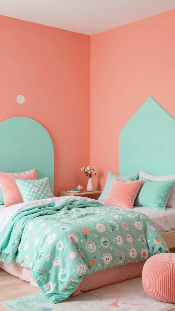
Soft Coral and Fresh Mint inject a playful spark. Coral anchors larger pieces; mint lights up décor and textiles. It shines in kids’ rooms or creative studios. The vibe is bright, friendly, and inviting.
Try playful patterns on bedding or curtains. Balance with plenty of white to keep airiness. Mix textures such as knits and smooth fabrics for depth. This palette fuels creativity and joy.
• Use coral large pieces for impact
• Add mint accents in textiles
• Layer textures for depth
• Keep walls white to stay airy
It sparks joy and imagination.
11. Neon Accents with Neutral Base
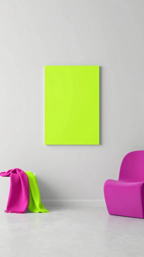
Neon Accents with Neutral Base make a bold gallery feel. White or gray walls set the stage for bright neon decor. It’s popular in compact city flats and creative spaces. The glow adds a youthful, energetic vibe.
Keep furniture simple so neon shines. Place neon art on a single wall to avoid overload. Balance with calm neutrals to ground the look. It reads fresh and confident.
• Use neon accents as focal pieces
• Choose minimalist furniture to let pops shine
• Place neon art on a single wall
• Balance with soft neutrals to avoid overload
This style feels fresh, daring, and fun.
Fun fact: 2 neon accents on a neutral base can visually expand a small space by up to 30%. Keep furniture minimalist so the glow remains the focal point and your color theme ideas stay fresh and balanced.
12. Earthy Browns and Soft Blues
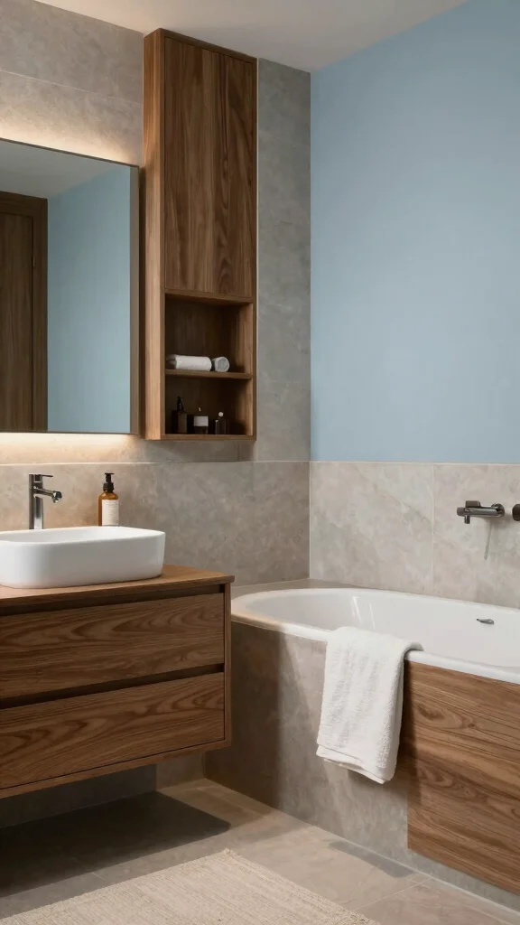
Earthy Browns and Soft Blues create a spa-like escape. Wood tones anchor the space, while pale blues cool the mood. This fit works in bathrooms and bedrooms alike. The effect is calm yet cozy.
Install natural stone for a rustic touch. Layer blue linens to boost comfort. Let in plenty of daylight to keep the room bright. It invites calm, whether you’re bathing or resting.
• Use natural stone features in baths
• Layer soft blues in linens
• Pair with warm wood accents
• Let daylight flood the space
It feels peaceful, inviting, and serene.
13. Warm Reds and Soft Creams
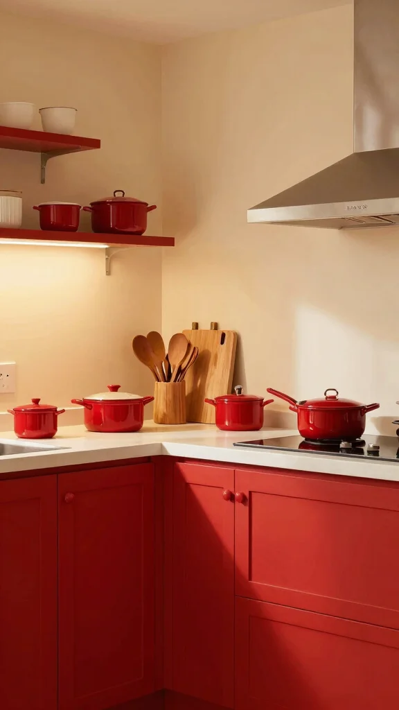
Warm Reds and Soft Creams warm kitchens and family rooms. Red accents or walls bring energy, while creams keep it gentle. The look invites sharing and comfort. It feels homely and welcoming.
Add a wooden dining set for warmth. Display red cookware as a feature. Use warm lighting to keep things cozy. It’s ideal for spaces where family gathers.
• Use red accents for focal points
• Pair with creamy walls to soften
• Add wooden furniture for warmth
• Choose warm bulbs to glow
It invites gatherings and connection.
14. Classic Black and White with a Twist
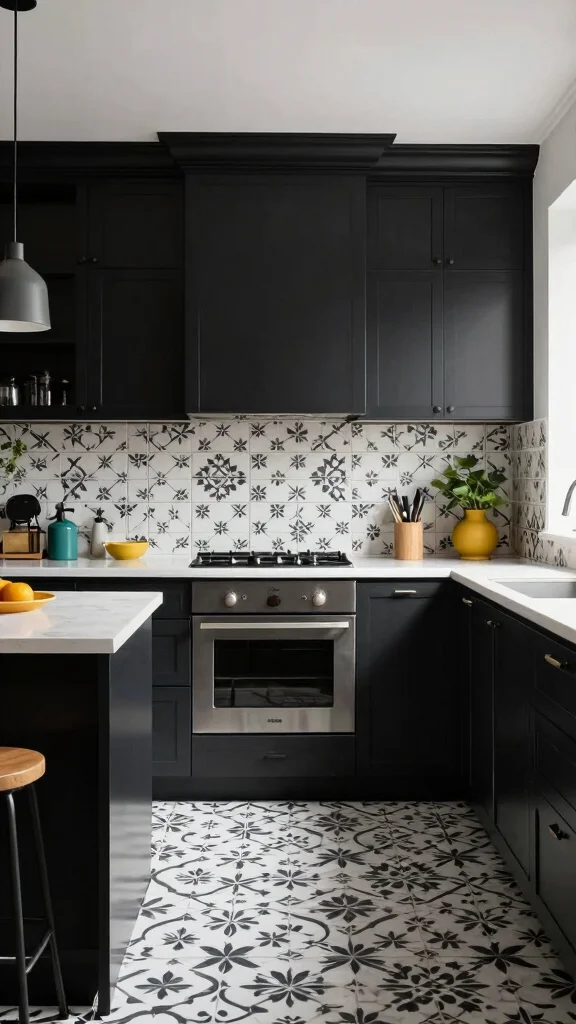
Classic Black and White with a Twist stays timeless yet fresh. A hint of color makes it lively. Patterned tiles or bold accessories shake up the look. This works well in kitchens and baths.
Add teal or mustard for surprise. Keep furniture sleek and simple for balance. Let textiles and art carry the color pulse. The pair stays elegant with a modern edge.
• Use patterned tiles to add interest
• Add teal or mustard for surprise
• Keep furniture minimal for polish
• Balance with varied textures
It feels elegant with a modern edge.
15. Light Teal and Creamy Beige
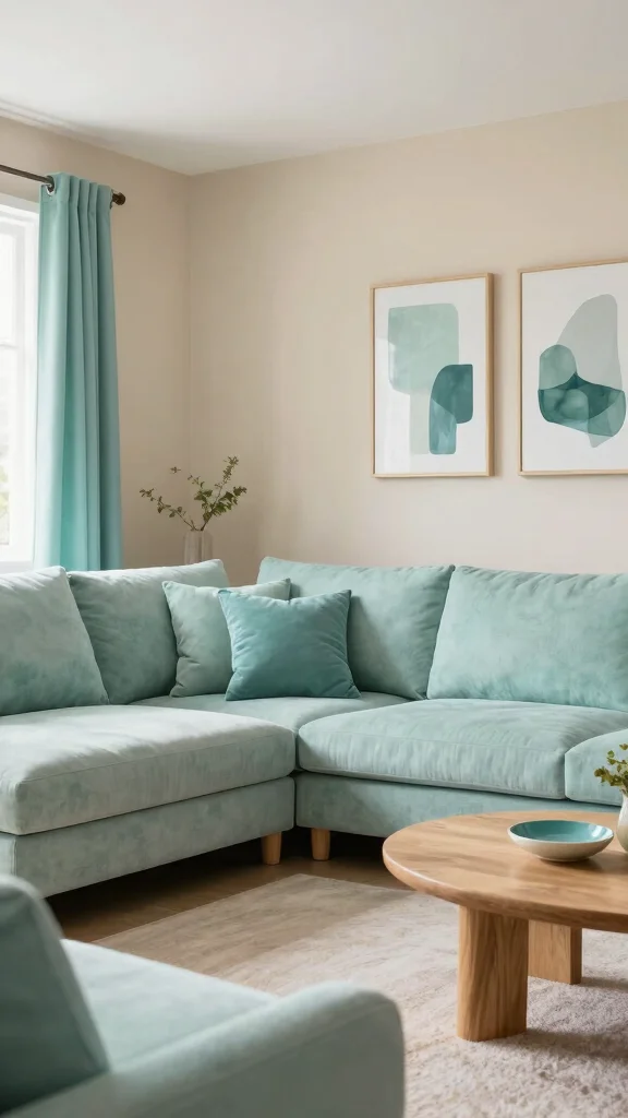
Light Teal and Creamy Beige offer a soft, airy feel. Teal accents lift beige walls, creating fresh harmony. You’ll find this combo in living rooms and baths. It gives a calm, coastal vibe with a touch of warmth.
Try teal textured fabrics on pillows. Add natural wood for balance. Let in ample light to keep the space bright. This palette shifts rooms to a relaxing retreat.
• Use teal cushions for a pop
• Add beige walls for warmth
• Pair with natural wood elements
• Keep lighting bright and even
It brings a calm, inviting glow.
16. Fresh Greens and Soft Whites
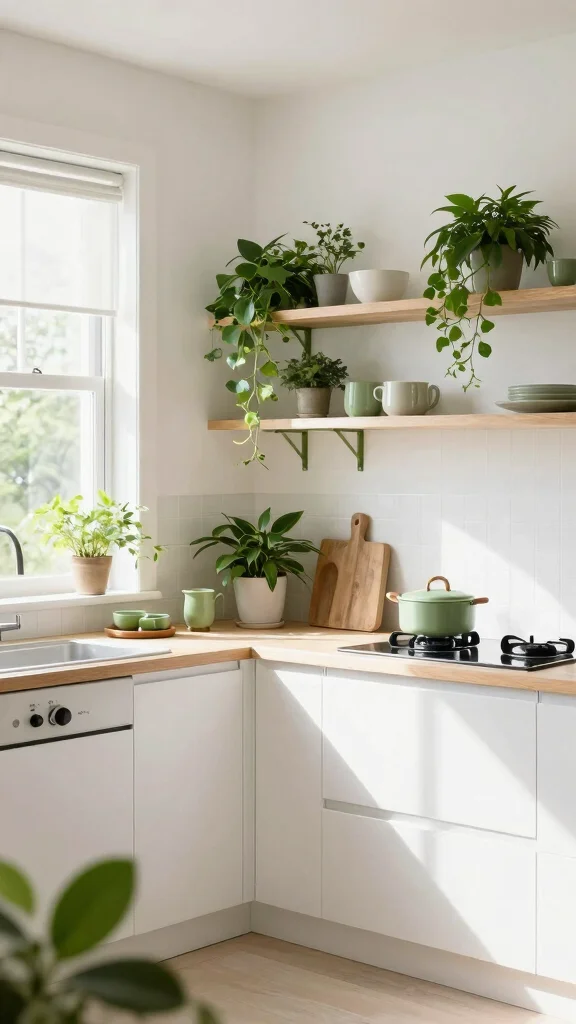
Fresh Greens and Soft Whites feel alive and clean. Greenery brings the outdoors in, while soft whites keep things light. This approach mirrors biophilic trends in homes. It creates a lively, healthy mood.
Use varied greens in plants and art. Layer whites in textiles and surfaces for depth. Let natural light flood spaces to lift mood. The result is bright and refreshing.
• Use varied greens in plants and art
• Layer whites in textiles and surfaces
• Let natural light flood the room
• Add ceramic or wood accents
It feels healthy, bright, and revitalizing.
17. Urban Grey and Rustic Wood
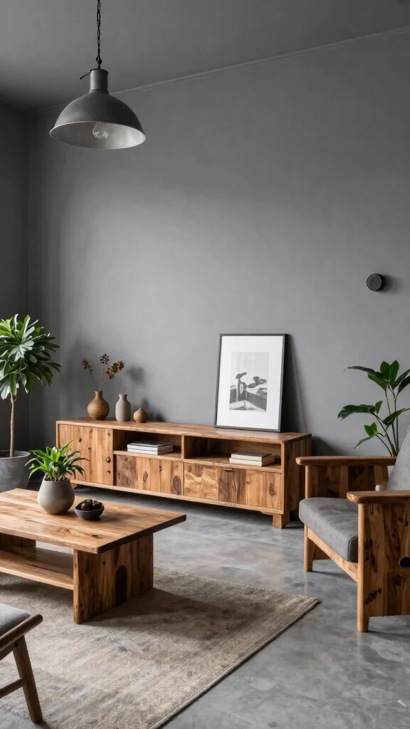
Urban Grey and Rustic Wood blend city style with warmth. Grey walls or furniture meet rough wood for contrast. It fits open plan living and lofts. The look stays grounded, not cold.
Add industrial lamps and metal details to edge it. Bring in green plants to soften steel. Layer textures from fabrics, rugs, and wood. This mix feels balanced and welcoming.
• Use grey as a main color
• Choose rustic wood for contrast
• Add industrial lighting fixtures
• Layer textures for depth
It grounds a space with comfort and style.
18. Warm Peach and Deep Navy
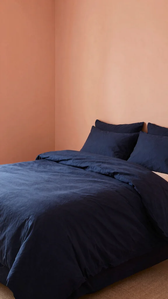
Warm Peach and Deep Navy create warmth and depth. Peach softens spaces, while navy anchors them. This combo shines in bedrooms and cozy reading nooks. It feels refined yet inviting.
Use warm lighting to highlight peach tones. Add textured throws for comfort. Choose art that brings both colors together. The result is a snug, sophisticated retreat.
• Use peach for bedding or walls
• Add navy accents in pillows
• Layer textures for comfort
• Choose art that blends both colors
It offers a cozy yet refined retreat.
❝ Fun fact: Peach tones can boost perceived warmth by up to 30%. Deep navy adds about 20% depth, and together they cozy bedrooms without overpowering walls. ❞
Conclusion
Incorporating color into your home can transform not only the space but also the feeling you have within it.
Each of these trending palettes for 2025 offers a unique way to express your style while bringing comfort to your daily life.
Whichever theme you choose, remember that your home should reflect who you are and be a sanctuary filled with warmth and happiness.
Frequently Asked Questions
What are the most practical color theme ideas for a room makeover in 2025?
For a room makeover inspired by 18 trending palettes, start with a calm neutral base and layer in one bold accent color to anchor the space. Your color theme ideas should balance mood and function for comfort.
Practical steps: choose a base (warm gray, taupe, or cream), select a primary accent from the palette, test color swatches on a wall at different times of day, and carry the hue into décor like cushions, curtains, and art to guide the transformation with comfort in mind.
Keep notes and adjust lighting to ensure the transformation feels cohesive.
How can I keep a cohesive look across multiple rooms when using various color palettes?
Start with a universal neutral base that appears in all rooms and repeat one or two accent colors from your chosen palettes in accessories across spaces. The color theme ideas become a thread that ties rooms together, while transformation stays intentional rather than random.
Follow the 60-30-10 rule (60% dominant color, 30% secondary, 10% accent) and balance warm and cool tones for comfort.
Which color palettes are trending for different rooms in 2025 and how should I use them?
Living rooms lean toward earthy greens and warm neutrals; kitchens shine with crisp whites, soft grays, and natural wood; bedrooms feel serene with pastels or muted blues; bathrooms glow with sea-inspired hues like teal or sage. Pick one palette per room, then borrow signature hues to echo across spaces so your home shows a thoughtful transformation with comfort throughout.
Test material swatches, consider lighting, and plan textiles (curtains, rugs, bedding) to anchor the look.
How can I apply trending color palettes without repainting every surface?
Use fabric, textiles, wall decals, or removable wallpaper to introduce the palette. Start with an accent wall or statement piece, then carry the color into cushions, throws, lamps, and artwork.
If you do repaint, paint the ceiling or trim in a subtle shade from the palette to create continuity. This approach delivers a strong transformation while preserving budget and disruption, with comfort in mind.
How do lighting and texture influence the look of color palettes during a room makeover?
Lighting dramatically changes color perception. Natural light makes colors airy, while warm bulbs intensify coziness. Pair colors with textures like wood grain, velvet, or linen to deepen the palette’s depth and keep the room comfortable.
Test swatches in different lighting and at different times of day, and mix textures to ensure the color theme ideas translate into real warmth and comfort.