Choosing the right home wall colour can feel overwhelming, especially with so many options out there. I wanted to create this post because a fresh coat of paint can completely change the vibe of your space. A new colour can make your home feel more welcoming, stylish, or even energetic. Whether you’re looking to make a bold statement or create a calming retreat, the right shade can work wonders.
If you’re someone who loves home styling and is ready to transform your living space, this guide is made for you. Maybe you’re tired of your current walls, or perhaps you’re just starting to explore the world of colour in decor. Whatever your situation, you’ll find something here that sparks inspiration and gets your creative juices flowing.
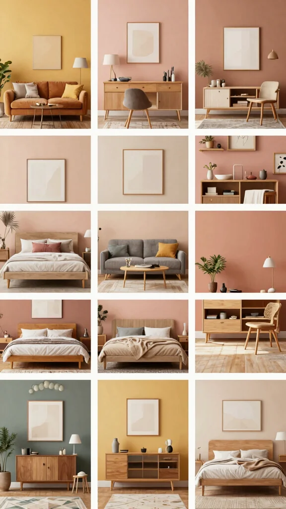
In this post, I’ve pulled together 22 home wall colour ideas that are sure to refresh your home. From the vibrant energy of a bright sunflower yellow to the soothing tones of sage green, each suggestion offers a unique way to update your space. You’ll not only gain insight into which shades to consider, but also practical tips on how to incorporate them with your existing furniture and decor. So, let’s dive into these colour ideas that can breathe new life into your home!
Key Takeaways
– Explore 22 unique wall colours that can instantly refresh your space, including options like playful coral and elegant charcoal grey.
– Discover combinations that work well with bold furniture choices to create a cohesive look throughout your home.
– Learn about the emotional impacts of different shades, helping you choose colours that align with the mood you want to create.
– Get practical tips on how to test colours in your space and consider lighting for the best results.
– Understand how the right wall colour can enhance your home’s overall aesthetic and complement your personal style.
Contents
- 1. Bold Crimson Red
- 2. Soothing Sage Green
- 3. Bright Sunflower Yellow
- 4. Deep Navy Blue
- 5. Playful Coral
- 6. Elegant Charcoal Grey
- 7. Crisp White
- 8. Rustic Terracotta
- 9. Gentle Lavender
- 10. Energetic Teal
- 11. Timeless Beige
- 12. Vibrant Aqua
- 13. Warm Maple
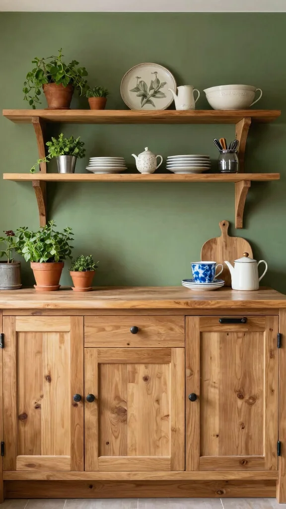
- 14. Rustic Olive Green
- 15. Chic Blush Pink
- 16. Refreshing Mint Green
- 17. Moody Plum
- 18. Earthy Brown
- 19. Bright Berry
- 20. Soft Seafoam
- 21. Bright Lemon Zest
- 22. Sunset Orange
1. Bold Crimson Red
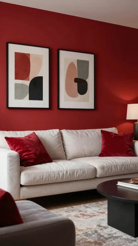
Crimson red makes a room feel bold and full of life. It creates a strong, confident backdrop that catches the eye from across the room. Use it on a feature wall or behind a desk to spark focus and energy. Pinterest fans this shade in modern spaces, showing how a single wall can redefine a space with drama and warmth. The result is a room that feels vibrant yet inviting, not loud when balanced well.
2. Soothing Sage Green
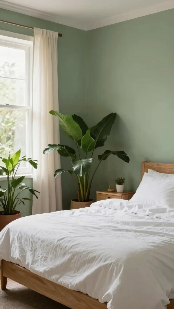
Sage green softly anchors a room with a sense of calm. It works best as a soothing backdrop in bedrooms or quiet corners. The hue invites gentle contrasts, letting natural wood and leafy plants stand out. As seen in many spa-inspired spaces, this shade creates a serene vibe that still feels modern and fresh. The overall effect is a cozy, breathable atmosphere you can live in daily.
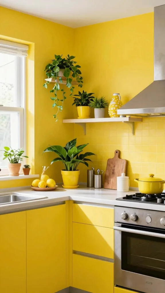
3. Bright Sunflower Yellow
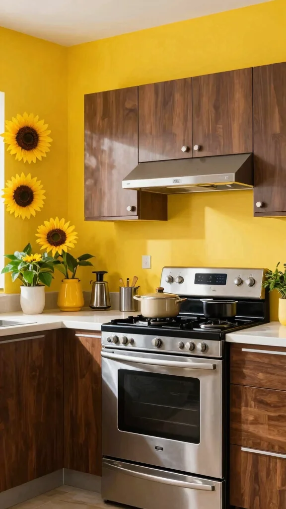
Bright sunflower yellow brings a sunny lift to any room. It energizes kitchens or play areas and makes spaces feel cheerful. When paired with dark woods or stainless steel, it creates a crisp, modern contrast. The glow it adds can lift moods and spark conversation, turning ordinary days into lively moments. It feels both friendly and stylish when used thoughtfully.
4. Deep Navy Blue
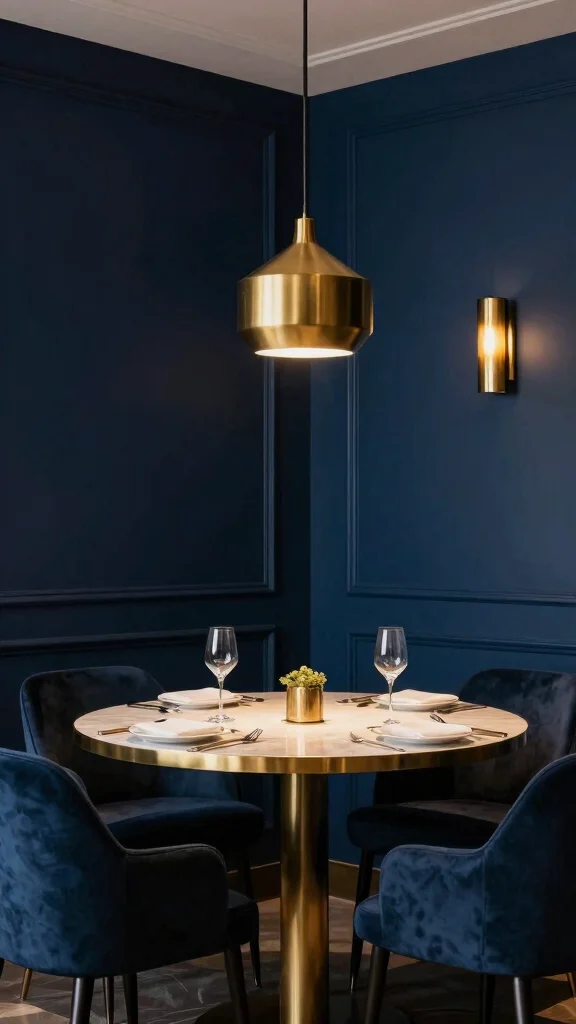
Deep navy blue anchors a room with timeless elegance. It reads luxe, especially when paired with gold or brass accents. This shade shines in a cozy reading nook or a refined dining area. The key is good lighting so the color never feels heavy. White or cream elements balance the depth and keep the space inviting. Navy offers drama without shouting, a quiet confidence for specialty rooms.
5. Playful Coral
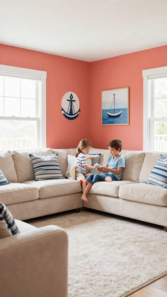
Coral blends pink and orange for a warm, lively mood. It adds a friendly glow to family rooms or cozy reading nooks. This shade works with blues and greens to create a fresh, coastal vibe. A little coral goes a long way, so use it where you want cheer without overpowering the space. The warmth makes rooms feel inviting and joyful.
6. Elegant Charcoal Grey
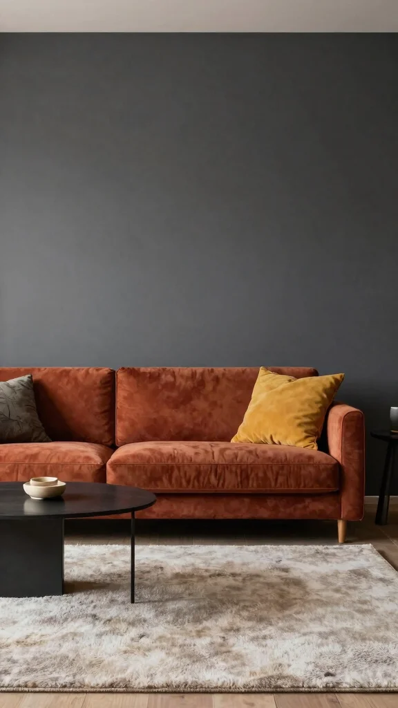
Charcoal grey brings modern polish to any space. It allows bright furniture to stand out while adding depth. A modern living room or studio can feel more grounded and refined with this hue. To avoid a flat look, pair it with soft textures and warm lighting. The result is a sophisticated base that invites bold colors and art.
7. Crisp White
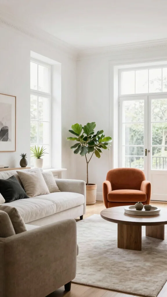
Crisp white creates a clean, airy canvas. It makes small rooms feel larger and serves as a quiet stage for bold furniture. White also invites natural light and helps artwork glow. Add variety with textures like linen, rattan, and greenery to avoid a sterile vibe. A layered look with off whites adds warmth while keeping the space bright and open.
Crisp white as your home wall colour creates a flexible canvas for bold furniture—use it to brighten small rooms and let artwork shine. Layer with textures like linen and greenery, and tweak with off-whites for warmth without dulling the glow.
8. Rustic Terracotta
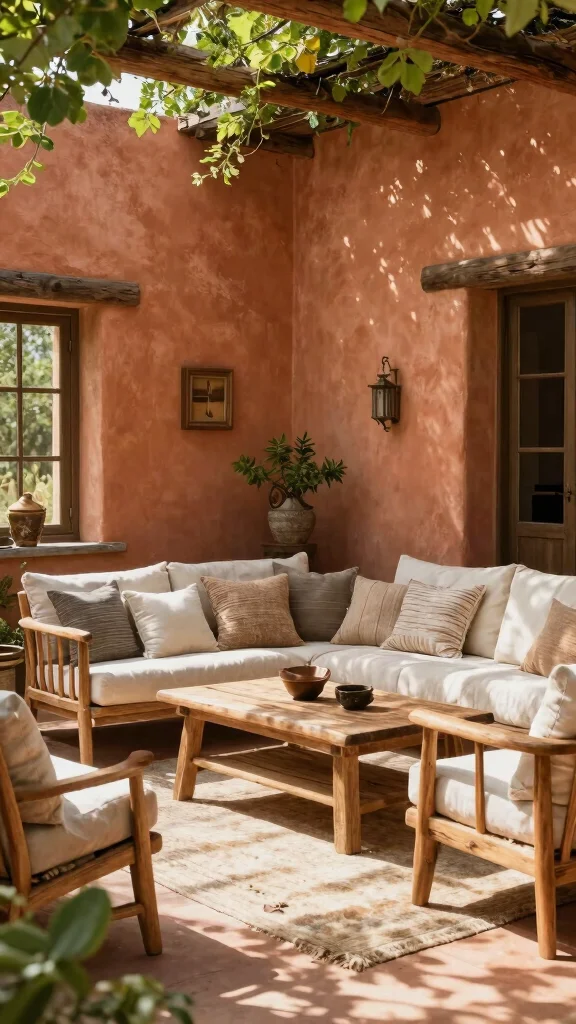
Terracotta brings warmth and earthiness indoors. This muted orange is grounding and welcoming, perfect for living areas that feel cozy and lived-in. It shines with wood, stone, and natural textures that emphasize a rustic or bohemian vibe. For outdoor spaces, terracotta hues harmonize with the outdoors and sunlit rooms. Keep the look soft with creams and olive greens and let the texture do the talking.
9. Gentle Lavender
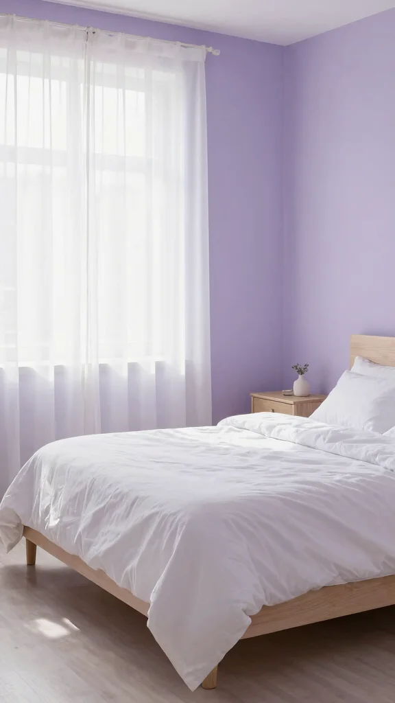
Lavender offers a calm, fresh feel ideal for bedrooms and baths. Its soft tone makes spaces feel airy and peaceful. It pairs well with whites and pale greys to maintain a serene vibe. A subtle lavender wall keeps the room gentle, while soft textures like velvet or faux fur add cozy depth. Light wood tones bring warmth and balance to the cool hue.
10. Energetic Teal
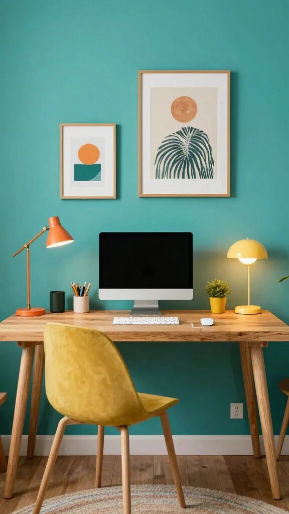
Teal brings a lively, creative spark to a room. It works well in living rooms or home offices where focus and conversation thrive. The color pairs nicely with gold or orange to create a balanced, warm contrast. Use teal on a feature wall to highlight the hue while keeping other walls light. Add metallic accents and natural wood for a grounded, stylish mix.
11. Timeless Beige
Beige is a versatile neutral that brings warmth and ease. A beige wall offers a soft, inviting backdrop for bold furniture and art. It keeps spaces feeling light without looking plain. Layer different beige tones with creams for depth, and add textures like woven fabrics and wood to enrich the sense of coziness. This color works in almost any room, making transitions feel natural and calm.
Fun fact: Subtle beige shifts of just 1–2% can warm a room and transform a home wall colour into a soft backdrop for bold furniture. Layer creams, textures, and wood to add depth—without sacrificing calm.
12. Vibrant Aqua
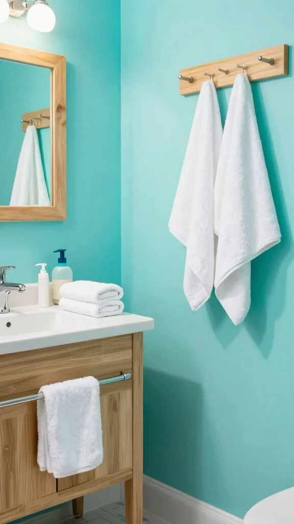
Aqua feels bright and vacation-like. This color livens up bathrooms and kids’ rooms with its tropical vibe. White or light wood around aqua heightens the fresh feel and keeps things breezy. A small touch—like a single aqua wall or accents—brings energy without overwhelming the space. Add beachy decor to pull the vibe together for a relaxing, cheerful mood.
13. Warm Maple
Warm maple brings a rich, inviting glow to living spaces. The blend of deep browns with soft undertones creates a calm, sophisticated feel. It marries well with cream or off-white to soften the look and keep things cozy. Use warm maple on a focal wall or in a den to build a sense of comfort. Accents of natural textiles and wood artworks reinforce the earthy mood and create harmony throughout the room.
14. Rustic Olive Green
Olive green gives a rustic feel that brings nature indoors. It works well with wood and natural textiles, making it a natural fit for country or farmhouse styles. The color sits warmly in the background, letting bold decor stand out. You can either cover all walls or use it as an accent to create focal points. Pair with yellows or earthy tones, add plants, and lean into botanical art for a cohesive look.
15. Chic Blush Pink
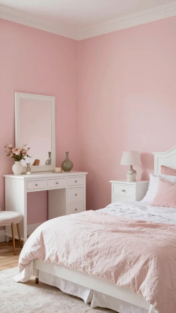
Blush pink is soft, romantic, and versatile. It can turn a bedroom into a quiet retreat or a feminine living area into a calm space. When paired with metallic accents like gold or silver, blush feels modern and polished. Use it as an accent or paint all walls for a dreamy vibe. Combine with vintage furniture for timeless charm, and add plush textiles to deepen the welcoming, cozy mood.
16. Refreshing Mint Green
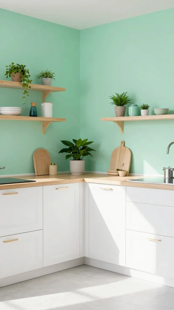
Mint green feels fresh and calm, great for kitchens and baths. It brightens spaces while keeping a cool, soothing mood. It pairs well with white or dark wood accents, giving a clean, modern touch. Use mint on an accent wall to pop color without overwhelming. Balance with plants or wooden accessories for a natural look, and add playful decor to highlight the theme.
Fun fact: Mint green as a home wall colour can visually brighten a small kitchen by about 20% and feel more spacious. Pair it with white or dark wood accents, use mint on an accent wall, and finish with plants for a fresh, calming vibe.
17. Moody Plum
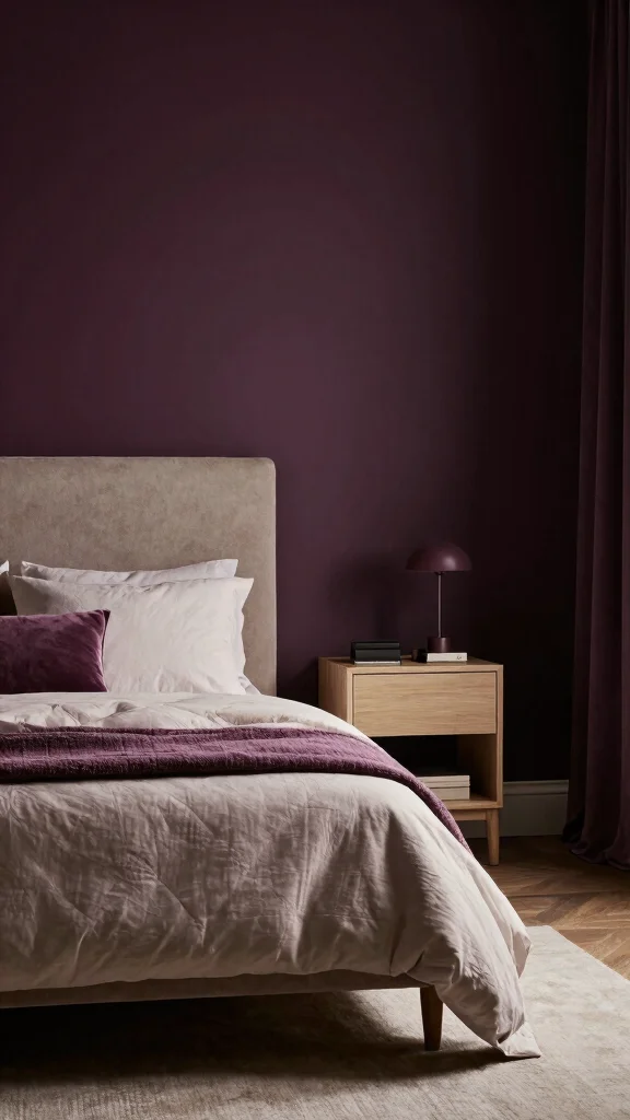
Moody plum adds depth and a sense of luxury. It works well in bedrooms or lounges where you want a cocoon-like feel. When paired with light furniture or metallic accents, plum keeps balance and avoids heavy gloom. Use it on an accent wall to deliver a bold touch. Layer in soft neutrals and warm textures to ground the look. Art with contrasting colors can sharpen the overall scheme.
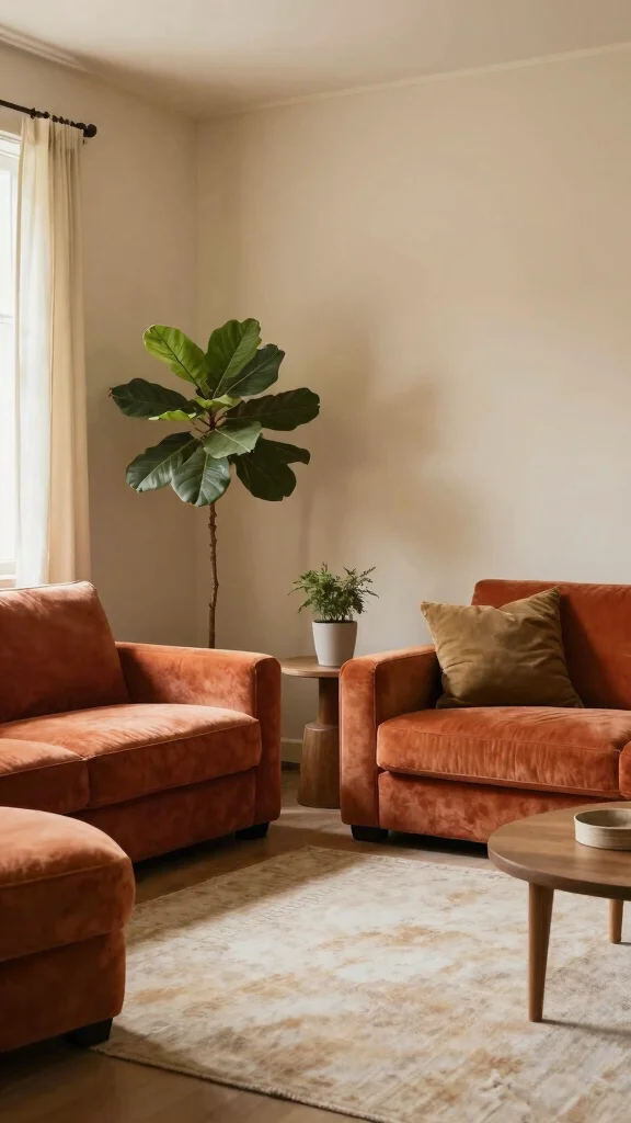
18. Earthy Brown
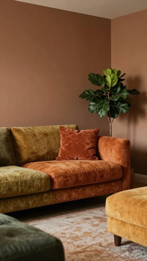
Earthy brown brings warmth and comfort to any room. It pairs well with bold furniture, allowing pieces to stand out against a rich backdrop. This shade invites relaxation and creates a grounded atmosphere. Use it as a primary color for a cozy home, then mix textures with fabrics, plants, and woven accents to add liveliness. Balance the richness with lighter details so the space remains open and inviting.
19. Bright Berry
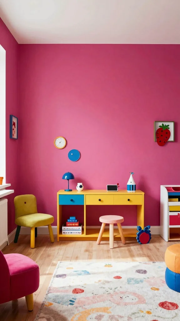
Bright berry brings cheerful energy to any space. It works nicely in children’s rooms or creative zones where play and imagination thrive. Berry tones shine as accents, providing a playful spark without dominating the decor. Pair with soft neutrals to keep balance, or use it on furniture for a bold statement. Add whimsy with decor that mirrors the color’s lively spirit.
20. Soft Seafoam
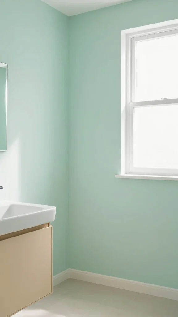
Soft seafoam brings a coastal, calm feeling. It fits beautifully in bathrooms and bedrooms, creating a serene retreat. This pastel shade pairs well with sandy tones and whites to keep the look light and breezy. For a tranquil escape, paint all walls seafoam or use it as a gentle accent. Add light wood elements and natural textures to reinforce the beachy mood and keep the space feeling fresh.
21. Bright Lemon Zest
Bright lemon zest is the color of sunshine. It wakes kitchens and dining areas with a lively, joyful vibe. Pair it with deep blues or fresh greens to create a bold, cheerful contrast. Use lemon zest on an accent wall to keep the energy high while surrounding pieces stay calm. Balance the brightness with light furniture and soft textures so the room feels energetic but not chaotic. Add decor that repeats the color for a cohesive look.
22. Sunset Orange
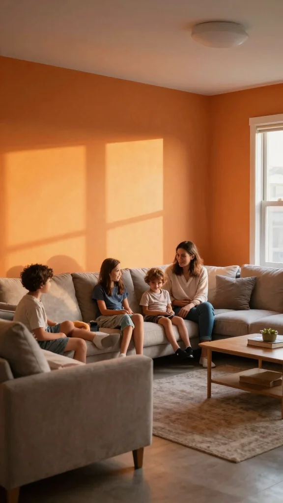
Sunset orange brings warmth and a welcoming vibe. It works well in kitchens or family rooms where you want a cozy, lively mood. Balance this vibrant hue with neutral furniture to avoid overpowering the space. Use it as an accent wall to create a bold focal point, then soften with soft textiles in complementary colors. Warm wood accents and natural textures help unify the look and keep the room inviting and comfortable.
Conclusion
Choosing the right wall color can dramatically alter the mood and style of your home.
From tranquil pastels to bold, vibrant hues, each shade offers unique opportunities for personal expression through home styling.
Experimenting with these color ideas can help you find the perfect palette that complements your bold furniture choices and transforms your space into a reflection of your personality.
Frequently Asked Questions
How do I choose a home wall colour that pairs well with bold furniture to elevate home styling?
Start with a neutral base for the walls and let bold furniture do the talking. Choose a home wall colour with undertones that complement your furniture shade. Test large swatches on full wall areas in natural light, not just tiny samples.
To keep home styling cohesive, balance a dramatic piece with calmer neutrals like warm beige, taupe, or soft gray, and add color through textiles and art rather than walls.
What are some vibrant wall colours that instantly update a room without clashing with bold furniture?
Vibrant doesn’t have to mean chaos. Try a vibrant wall colour like deep teal, emerald, navy, or plum as a feature wall to create drama without overpowering bold furniture. If you prefer lighter spaces, use a vibrant accent on a single wall or behind seating while keeping the other walls neutral. Always test swatches in your lighting and bring in textile bits and art to tie the look together for home styling.
How can I test and choose a home wall colour before committing to bold decisions?
Start with large swatches or temporary samples on wall sections, then observe at morning and evening light. Use a digital room planner or take photos to compare. Consider the finish—matte or satin affects how colour reads. Do a small pilot area if possible, so you can refine your choice before painting the whole room.
How can I update a space quickly with wall colour while keeping bold furniture as the focal point?
Choose a calm base for the walls to let bold furniture shine; light neutrals or soft gray work well with vibrant pieces. Add cohesion with textiles and decor that echo the wall colour family, and use an accent wall behind the seating area for anchor. Use lighting to highlight the colour and create mood. This quick update has lasting impact on your space.
What common mistakes should I avoid when using vibrant wall colours with bold furniture?
Avoid mixing too many vibrant shades on walls; keep the palette limited to one main wall colour and one accent tone. Don’t ignore lighting—colors look different under daylight vs artificial light. Consider room size and scale; bold walls in small spaces can feel overwhelming. Also choose the right finish for durability and maintenance to keep your home wall colour looking fresh.